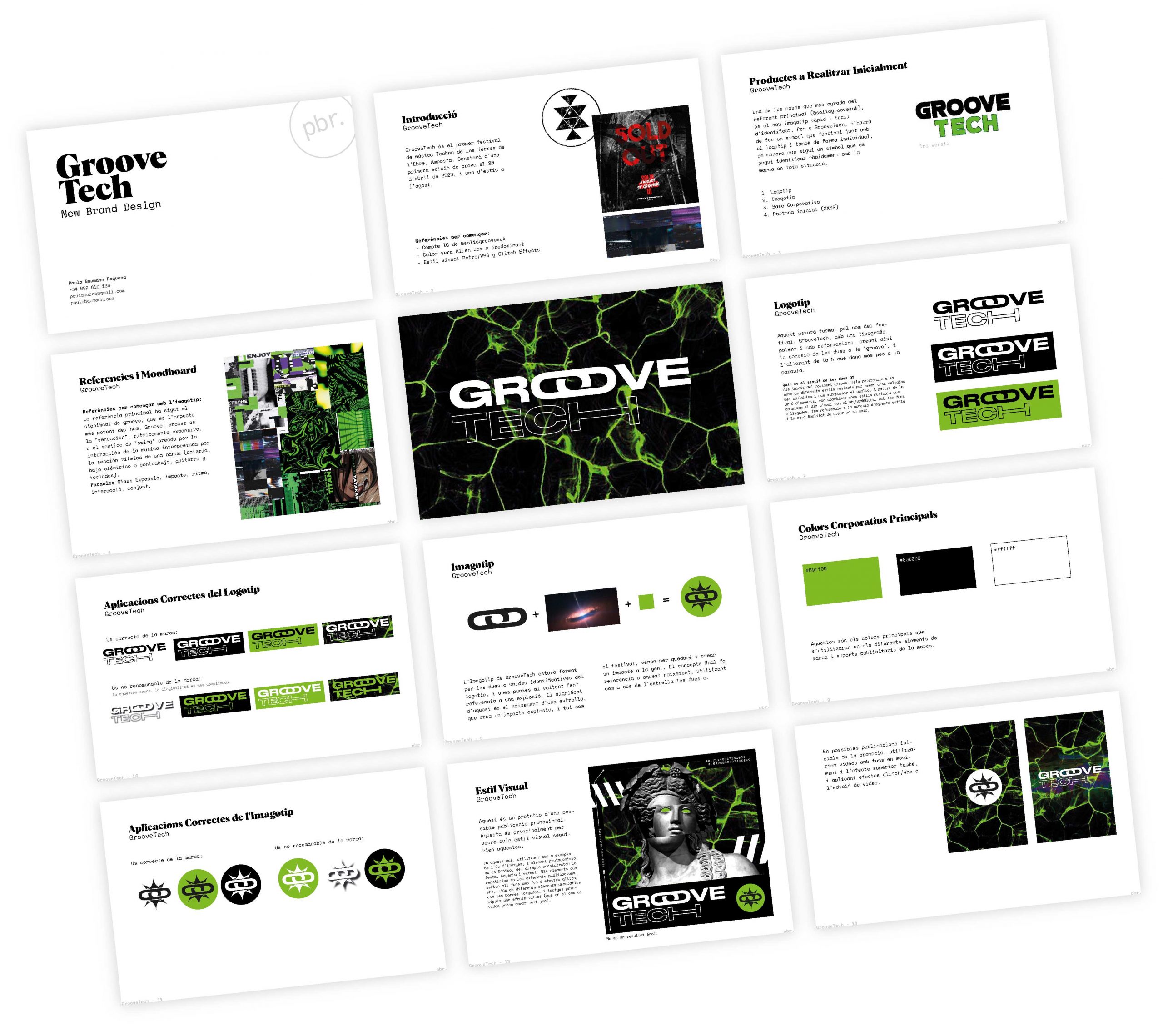
Groove Tech is an electronic music festival based in Amosta, Spain, focused on delivering immersive techno experiences through music, light and energy. The festival aims to position itself as a fresh, vibrant event for a new generation of electronic music lovers.
For Element Air, I built an identity that communicates cleanliness, precision, trust and innovation. The logo uses geometric shapes inspired by circulation and airflow, with cool tones and modular visual structure to reflect their sophisticated engineering and focus on health.
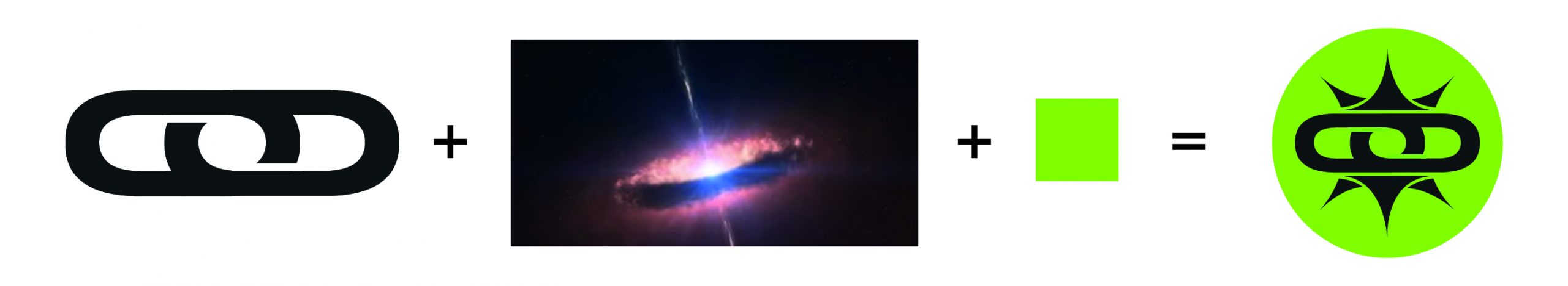
For Groove Tech, the challenge was to create a bold and modern identity that would capture the spirit of techno culture and stand out in a competitive festival scene. The visual concept centers on energy, rhythm and impact — taking inspiration from the explosive birth of a star.
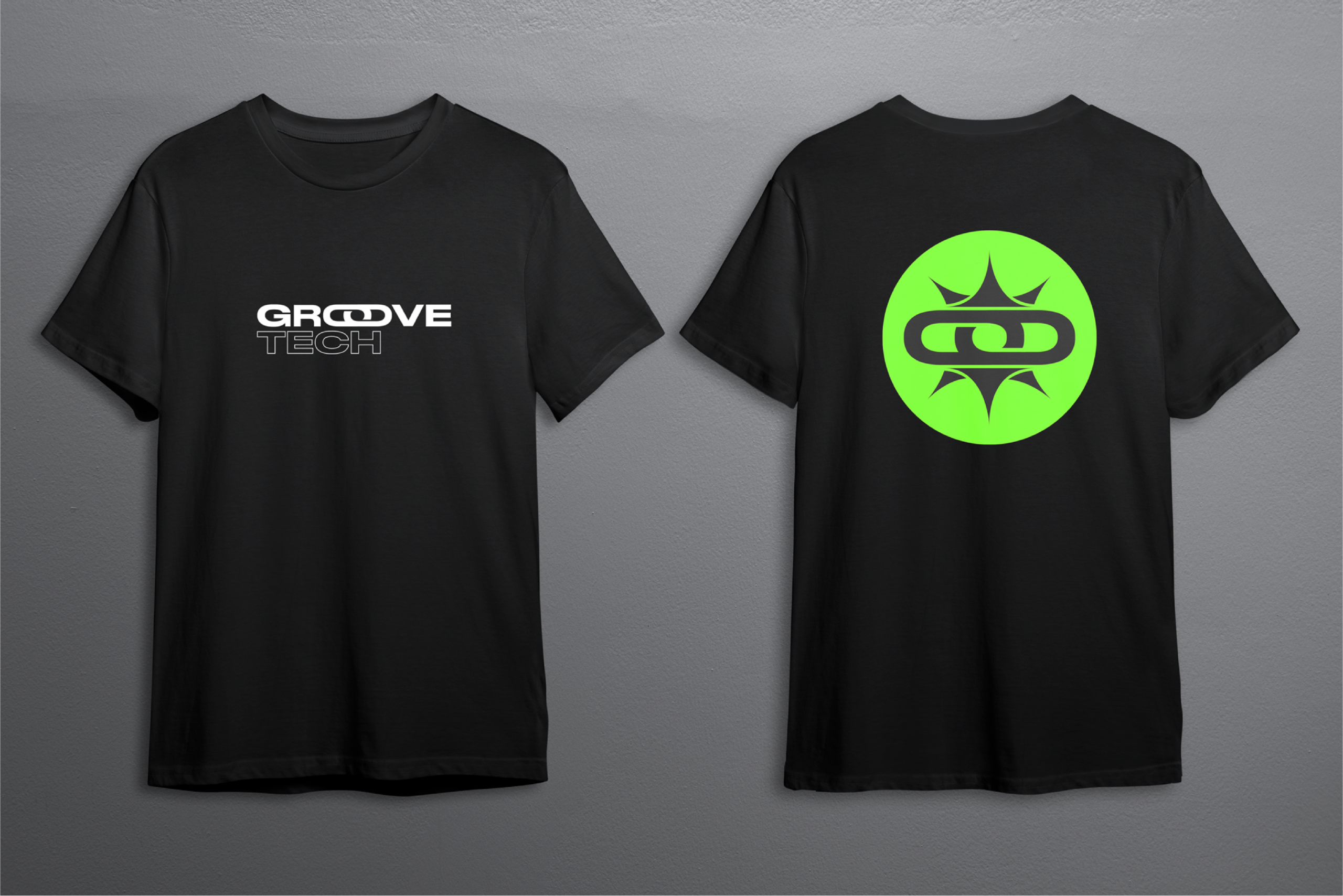
The logo is built around two interlinked O’s — representing sound, repetition and duality — surrounded by sharp spikes that suggest an explosive impact. This graphic metaphor reflects the festival’s ambition: to burst into the scene and leave a lasting impression.
The brand’s vivid green — almost fluorescent — was a direct request from the client and plays a key role in the identity. Combined with black and high-contrast visuals, the palette conveys vitality, movement, and futuristic energy, perfectly aligning with the festival’s atmosphere.